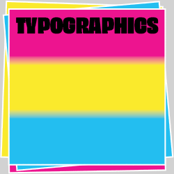
2018 Communications Design Judge’s Choice: A Shakespeare/Hip Hop Play
During the competition judging last January, we ask each of our eleven TDC competition judges to choose their favorite from all the entries. Jon Key chose a play that was written and designed by two Barcelona designers, İdil Gücüyener and Anna Kabanina, who also received the TDC second-place award for student work.
About İdil Gücüyener and Anna Kabanina’s Student Work, To Live and Die in Venice
- Designers: İdil Gücüyener and Anna Kabanina, Barcelona, Spain
- Instructor: Pol Pérez
- Typography tutor: Laura Meseguer
- School: ELISAVA Barcelona School of Design and Engineering
- Principal Type: Akzidenz-Grotesk Extended, Akzidenz-Grotesk Medium Extended, Pitch Regular, William Regular, and William Regular Italic
![]() İdil Gücüyener and Anna Kabanina’s To Live and Die in Venice.
İdil Gücüyener and Anna Kabanina’s To Live and Die in Venice.
To Live and Die in Venice is a play that experiments with similarities and differences between hip-hop and Shakespeare by making these two worlds collide through the use of typography and imagery. The story is an interpretation of the Shakespearean classic Othello set in hip-hop’s golden age—the 1990s.
Although Shakespeare and hip-hop may seem contradictory, there are parallels in terms of artistic expression, the use of wordplay, lyricism, and rhythm. Love, jealousy, violence and betrayal are subjects common in both.
In a freestyle rap battle, quick thinking and the ability to respond quickly are key. Competitors dis one another with clever lyrics amid a complex game of words. Such battles are similar to the medieval tradition of “flyting”—a poetic exchange of insults that appears in several works of Shakespeare.
To Live and Die in Venice creates the atmosphere of a play with serif typefaces, tabulations, and navigation elements commonly found in scripts. When characters face arguments, hip-hop is introduced with battle rap lyrics. As the story heats up, highlights, violated text blocks, and images reflect the offensive and blitz of the battle rap environment.
 Inside spread of To Live and Die in Venice.
Comments by Communications Design Judge Jon Key
“With a background in both theater and graphic design, I am constantly looking to merge these two forms into a context that elevates the source material and lends new meaning to the work. Unsurprisingly, I was immediately drawn to this bright orange book with “Othello” spaced in Blackletter down the spine.
In To Live and Die in Venice, the designers dismiss conventions for play and script typesetting, presenting instead exploding typography that travels across the page. The Shakespearean play is adapted to create parallels between the studied lyricism of the past and the contemporary energy and urgency of hip-hop. The setting of the words animates the players’ lines while shifting faces express the personalities of individual characters.
To Live and Die in Venice is a beautiful display of confidence, control of language, complex grid structures, and movement with type, and a design object that expansively reimagines Othello’s world as a Shakespeare for today’s generation.
We were even more impressed upon discovering that To Live and Die in Venice was student work. As one flips through the volume, each page demonstrates unexpected refinement in execution and illuminates new interpretations of the text, all the while radiating the simple joy of designing. Fearless and bold, the gestures in the work assert a unique edge to these designers’ voices, and I am eager to continue listening.”
 Barcelona designers İdil Gücüyener and Anna Kabanina with their play at the TDC64 opening in New York. Photo: Mélanie Duault.
About Jon Key
Jon(athan) Key is an art director, designer, and writer originally from Seale, Alabama. After receiving his BFA from RISD, Jon began his design career at Grey Advertising in NYC before moving on to work with such clients and institutions as HBO, Nickelodeon, The Public Theater, and the Whitney Museum.
Jon is now one of the partners of the Brooklyn–based design studio Morcos Key with Wael Morcos. As an educator, Jon has taught at MICA, Parsons, and the American University in Beirut, and is currently the Frank Stanton Chair in Graphic Design at Cooper Union. Jon is also a Co-Founder and Design Director at Codify Art, a multidisciplinary collective dedicated to creating, producing, supporting, and showcasing work by artists of color, particularly women, queer, and trans artists of color.
Follow Jon Key online: Instagram | Twitter
 Jon Key portrait.