2018 Typeface Design Judge’s Choice: Lamon
This year, each of our eleven TDC competition judges chose their favorite from all the entries. Dyana Weissman chose Lamon, the typeface design created by Dmitry Lamonov for Art.Lebedev Studio in Moscow.
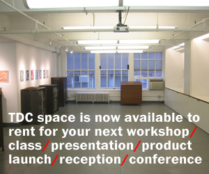
This award-winning publication is currently on display in The World’s Best Typography exhibition (TDC64) at Sheridan College’s Oakville campus in Ontario through December 14, and at the Dom Słów-Izba Drukarstwa (House of Words-Print House) in Lublin, Poland through December 31.
![]() Lamon by Dmitry Lamonov for Art. Lebedev Studio.
Lamon by Dmitry Lamonov for Art. Lebedev Studio.
About Lamon
- Typeface Design: Dmitry Lamonov, Moscow
- Art Direction: Artemy Lebedev
- Project Manager: Svetlana Kost
- URL: artlebedev.com
- Studio: Art.Lebedev Studio
Designer’s statement: “Lamon is a soft-natured display typeface. Lamon’s outlined glyphs are made of both uppercase and lowercase letters with the smaller letters hiding inside the bigger ones. The face’s smooth lines give street signs, packaging and decorative materials a friendly lightness, while the unexpected contrast involves the viewer in an interesting optical game.”
Comments by Typeface Design Judge Dyana Weissman
“Visually appealing. Technically skilled. Broadly usable. As judges, we kept these criteria in mind when making our selections. A conceptual typeface rarely meets all of these benchmarks; at least one usually falls by the wayside. But ALS Lamon hits them all, taking a simple concept (at least on the surface), and turning it into a lighthearted, well-drawn, easily readable typeface.
What makes it even more remarkable is it achieves its goal in both Cyrillic and Latin, bringing amusement to readers from all across the globe. Fellow judge Verena Gerlach was delighted with the charming pig found in the Ё/ë. My in-laws, stern cultural observers who emigrated to the United States from Russia in the 1990s, validated its cleverness in the Cyrillic.
The idea of nesting a lowercase form in an uppercase form sounds straightforward enough. But as with most conceptual projects, this is easier said than done. It is evident that each letter of Lamon is carefully considered. And the dynamics are fascinating: a shape becomes a contour, as in the Q/q. A form becomes a counterform, as in the Б/б. The G/g is just marvelous.
Looking closely, one sees that the upper- and lowercase letters are not merely stacked; they dance a lively Tchaikovsky waltz with each other. They are complex, smart, and enchanting. The typeface accomplishes so much with seemingly so little. Its excellence stands out in so many ways. For me, there was never any question that ALS Lamon should be a winner. ”
 Dyana Weissman portrait.
About Dyana Weissman
Dyana Weissman is the Senior Custom Designer at Type Network. For over 15 years, she has worked with international studios and brands including Adidas, john st., Loyal Kaspar, Marie Claire magazine, Korn Design, Pentagram, Interbrand, The Financial Times, and TIME magazine. Dyana studied Graphic Design at Rhode Island School of Design, where her interest in typeface design was cultivated. When she has time, or is spurred enough, she writes for Typographica.org and Alphabettes.org. She has presented her work at ATypI, TypeCon, and at universities around the country. When she isn’t doing all of that, she is taking photos, gardening, or hiking somewhere in the world.
Read more about Dyana and see her work here.