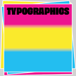
Philippe Apeloig’s Typorama

Philippe Apeloig is a graphic designer who loves letters. The new book Typorama makes this wonderfully clear in its 384 pages of designs and sketches by Apeloig, essays, and even the title. The word “typorama” suggests a wide perspective of typographic features, a panorama of Philippe Apeloig’s work.
Typorama presents Apeloig’s poster, publication, and identity designs from the early 1980s to the present. A 1983 design for the Dutch office Total Design is the earliest piece by Apeloig in Typorama, and it reflects Total Design’s modernist design legacy. Like all graphic designers in the 1980s, young Apeloig had to negotiate that decade’s ideological and technological turmoil in graphic design. Which would Apeloig follow: the familiar route of modernism or the postmodern sirens? Did he have the temperament to accept new digital tools?
It is almost enough of an answer to say that Apeloig prizes curiosity above almost all else. Curiosity led him to explore design outside of France, and he held two internships at Total Design in Amsterdam and one in Los Angeles with April Greiman. He finds inspiration in arts other than design, such as dance and literature. His peripatetic career in the United States and France as a teacher/designer/creative director suggests restlessness and a desire to try everything. For his early design of the well-known Chicago poster for the Musée d’Orsay, Apeloig challenged himself technically, pre-Mac, to distort the word Chicago in such a way that all the letters stayed sharp. He had to travel to Geneva to access the software he needed to make the distortion, and the poster is still his favorite, 27 years later. “I dream of a second chance at being so innocent!” said Apeloig in an interview on designboom.

In 1993, Apeloig traveled to Rome with the goal of designing typefaces. Despite his naïveté about the amount of work involved, he persisted and has used and refined these and other typefaces since then. The Swiss type foundry Nouvelle Noire recently released digital versions of ten of Apeloig’s typefaces.
Tino Grass edited and designed Typorama, with help from Philippe Apeloig on the cover design. The book’s layout balances structure and variety and allows easy access to Apeloig’s work. Alice Morgaine’s essay provides a chronology of Apeloig’s career within a context of recent French culture and design history, with frank descriptions of some of the challenges he has faced. Ellen Lupton’s analysis pays particular attention to the development of Apeloig’s signature sensibility and the combination of modernist systems and rebellion in his design process.
The word “typorama” suggests not only typographic vistas, but also American enthusiasm and optimism, and names like Futurama, used for an exhibition at the 1939 New York World’s Fair. It is appropriate that Apeloig visited New York to speak at the Type Directors Club on February 20th.
Typorama
The Graphic Work of Philippe Apeloig
Thames & Hudson
2013